
What Are the 7 C’s of Website Design?

A homepage can look polished and still fail quietly. Visitors glance at it for a few seconds, can’t tell what you actually offer, and leave without sending a single inquiry. If that sounds familiar, you need a way to judge a site that goes beyond personal taste. So, what are the 7 C’s of website design? They are a framework for checking whether a website works as a two-way customer interface: Context, Content, Community, Customization, Communication, Connection, and Commerce.
In this guide from LocalPro1, you will get each of the seven C’s of website design explained with practical examples, a simple scoring method for auditing your own pages, a modern alternative checklist, and the mistakes that waste most redesign budgets.
What Are the 7 C’s of Website Design? (Quick Answer)
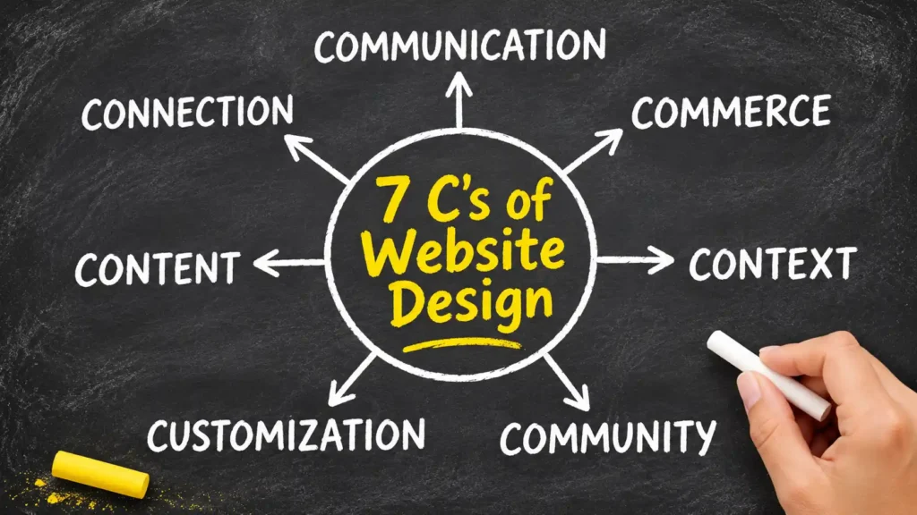
The 7 C’s of website design are seven areas used to judge how well a site serves its visitors: how it looks and is laid out (Context), what it says (Content), how people interact (Community), how it adapts to each person (Customization), how it talks back (Communication), how it links outward (Connection), and how it earns revenue (Commerce).
The classic list at a glance:
- Context: the look, layout, and feel of the site.
- Content: the words, images, video, and audio on every page.
- Community: the ways visitors can interact with each other and with you.
- Customization: how the site adapts to each user, or lets them adjust it.
- Communication: the two-way dialogue between the business and the visitor.
- Connection: the links and integrations that tie the site to the wider web.
- Commerce: the ability to sell, book, or capture leads.
The framework comes from Jeffrey Rayport and Bernard Jaworski, who built it around the customer interface, meaning everything a visitor touches while dealing with an online business. That origin explains why it reads more like a relationship checklist than a design rulebook.
The Seven C’s Explained One by One
Each C below covers what it means, a realistic scenario, and the slip people make most often. The scenarios are illustrations, not reported case study results.
1. Context
Context is the visual frame around everything else: layout, color, typography, image style, and tone. It answers a visitor’s first silent question, which is whether this place feels right for what they came to do. Picture a family dental clinic whose site uses neon colors and tiny grey text. The services may be excellent, but the frame says rushed and cheap. A calm palette, generous spacing, and real photos of the clinic tell a better story. The common mistake is choosing a look because it is trendy instead of because it suits the audience.
2. Content
Content covers everything a page contains: text, images, video, audio, and downloads. This is where trust is built or lost. Take a plumbing business that repeats ‘quality service’ on every page. A worried homeowner wants to know which areas are covered, how fast someone can arrive, and what the first visit costs. Specific answers beat slogans. The usual mistake is writing about the company instead of the visitor’s question, which creates long pages that say very little. Stale details, like an offer that ended last spring, quietly damage credibility too.
3. Community
Community is how visitors connect with each other and with the brand through the site. It might be a review area, a comment section, a member forum, or a public question and answer page. A neighborhood bakery that shows customer photos and answers questions openly creates a sense of belonging. The mistake is launching a forum nobody moderates. An empty discussion board is worse than none, because it signals that no one is listening. If you can’t staff it, choose lighter options such as curated reviews.
4. Customization
Customization means the site adapts to the person using it, or lets them adapt it. Think of a language switch, a saved basket, adjustable text size, or suggestions based on past views. For a clothing store, remembering a shopper’s size can remove several clicks. The common mistake is personalizing with weak data, such as recommending something a customer bought yesterday. Personalization that feels wrong irritates more than none at all, and it raises privacy questions, so be clear about what you store.
5. Communication
Communication is the conversation between the business and the visitor: menu labels, forms, chat, confirmation emails, and calls to action. Consider a contact form with twelve required fields when all you need is a name, a phone number, and the problem. Every extra field is a reason to quit. A good form also says what happens next, such as ‘we will call within one business day.’ The mistake is treating communication as a single contact page. It lives in every button label, error message, and thank-you screen, and a vague word like ‘Submit’ wastes the moment.
6. Connection
Connection describes how your site links to the wider web: outbound links, partner pages, social profiles, embedded maps, and booking tools. A restaurant that embeds its map, links to its reservation tool, and points to a local food guide that featured it gives visitors easy next steps. The mistake is careless linking. Broken links, outdated partner pages, and heavy embeds that slow the page all hurt. Avoid sending people away from a key action page before they have finished the action.
7. Commerce
Commerce is the site’s ability to turn attention into revenue, and that doesn’t always mean a shopping cart. For a store it is the catalog, cart, and secure checkout. For a law practice or a home cleaning service it may be a booking calendar, a quote request, or a phone number that works with one tap. Imagine a cleaning company that hides its price range behind a form. Visitors who only want a rough figure leave. The mistake is making buying harder than browsing. Surprise shipping fees, forced account creation, and slow payment pages are the classic offenders.
You may also read: Is Web Design Still Worth It in 2026?
The Modern Version: Clarity, Consistency, Credibility and More
Many designers now run audits with a different set of seven words: Clarity, Consistency, Content, Context, Credibility, Conversion, and Compatibility. This list is a convention used by practitioners, not one official standard, and it focuses less on theory and more on friction you can spot on a live page. Here is how the two versions line up.
| Classic C | Closest modern C | Best used when |
| Context | Clarity, Consistency | You want to know if a new visitor understands the page in seconds and the design feels uniform |
| Content | Content | Pages need to answer real questions |
| Community | Credibility | Reviews, testimonials, and public replies need to build trust |
| Customization | Compatibility | The site must adapt to devices, screen sizes, and user needs |
| Communication | Conversion | Forms, buttons, and follow-up messages need to move people to act |
| Connection | Compatibility | Maps, booking tools, and other integrations must work smoothly |
| Commerce | Conversion | The path from interest to purchase or inquiry needs smoothing |
Use the classic model for planning, the modern one for auditing. When you are deciding what a new site should do, the seven C’s of website design push you to think about community, personalization, and revenue from day one. When a live site is underperforming, the modern list gives you sharper questions. Is it clear? Is it believable? Does it work on this phone?
You may also read: Why Is Web Design Important?
How to Audit Your Website Using the 7 C’s
A practical way to use this framework, and the approach LocalPro1 recommends to small business owners, is a scored review instead of a debate about taste.
- Pick your key pages. Choose the homepage, your main service or product page, the contact or checkout page, and one blog post. Open each on a phone as well as a computer.
- Score each C from 1 to 5. Write one sentence of evidence beside every score. ‘Feels fine’ is not evidence. ‘The phone number isn’t tappable’ is.
- Find the weakest C. The lowest score, or the one closest to your main goal, gets your attention first.
- Fix that one first. Make a single focused change, such as rewriting a headline or shortening a form, so you can tell what caused any difference.
- Re-check in 30 days. Compare inquiries, form completions, and how long people stay, then score again.
A quick illustration. Imagine a small accounting practice whose homepage headline reads ‘Excellence in Every Number.’ A fresh visitor would score it a 2 out of 5 for Clarity, which sits between Context and Content in the classic model, because the page never says who the firm helps. Rewriting the headline to name the audience and the service, for example ‘Bookkeeping and tax filing for freelancers and small shops,’ is a one hour fix. This is a hypothetical, not a measured result, but it shows why the weakest C is often the cheapest place to start.
Common Mistakes People Make With the 7 C’s
- Treating it as a design-only checklist. Only Context is about looks, while Content, Communication, and Commerce decide whether the site actually works for people.
- Trying to improve all seven at once. Changes pile up, nothing can be measured, and you won’t know which fix helped.
- Copying a competitor’s layout. Their visitors, prices, and goals may differ from yours, so a borrowed layout often solves a problem you don’t have.
- Ignoring mobile and page speed. A site that stumbles on a phone fails Compatibility no matter how good the other six look.
- Adding features nobody asked for. A chat widget or login area with no one to staff or use it only adds clutter and upkeep.
Which C Should You Fix First?
Not sure where to start? Let the symptoms decide.
- Low traffic: look at Content and Context first. People can’t visit pages that don’t answer their questions or look relevant in search results.
- Traffic but few inquiries: look at Commerce, Communication, and Credibility. The visits are happening, so the path to action is the problem.
- High bounce on phones: look at Compatibility. Test on a real handset on mobile data, not only a desktop browser.
If your weakest scores point to deeper layout or build problems, it may be time to talk to a Web Design Company in NewYork that can restructure the pages instead of patching them.
Final Thoughts
The seven C’s give you a shared language for talking about a website without arguing about taste. Score your homepage today against each one, find the weakest, and fix that single thing before touching anything else. If you would like a second opinion on your scores, contact LocalPro1 and we will help you decide what to change first.
FAQs
What are the 7 C’s of website design?
They are Context, Content, Community, Customization, Communication, Connection, and Commerce. Together they describe how a site looks, what it says, how people interact with it, and how it supports a sale or inquiry. Rayport and Jaworski created the model for the online customer interface.
Are the 7 C’s the same as web design principles?
Not exactly. Principles such as hierarchy, whitespace, and contrast guide single design decisions, while the seven C’s of website design work as a wider health check on the whole site. Use both: principles to build pages, the C’s to judge results.
Which of the 7 C’s matters most?
It depends on your goal. For most small business sites, Content and Communication carry the most weight, because visitors need clear answers and an easy way to reach you. An online store would put Commerce near the top, while a hobby blog may care more about Community.
Do the 7 C’s apply to small business websites and blogs?
Yes, though you won’t need all seven at full strength. A local service site may skip Community and focus on Content, Communication, and Commerce, while a blog might lean on Community and Connection. The point is to choose on purpose rather than by accident.
Is the 7 C’s framework still relevant in 2026?
Yes, as a thinking tool. The seven C’s of website design don’t cover newer concerns such as accessibility, privacy choices, or speed on mobile data, so add those to your review. The core idea, judging a site by how well it serves a visitor, hasn’t aged.
Ready to Grow Your Business Online?
Get a custom strategy built around your goals. Our team will review your current marketing and show you exactly where the growth opportunities are.
- Free 30-minute strategy call
- Custom growth roadmap
- No obligation or hidden fees